
What Is Colour Psychology and Why Does It Matter in Interior Design?
Colour psychology is the study of how different colours affect human mood, behaviour, perception, and physiological responses. In interior design, it helps homeowners and designers make informed choices about paint, furniture, and accessories. These choices influence how a room feels, not just how it looks in photographs.
Understanding colour psychology turns colour selection into more than an aesthetic decision. It becomes a practical tool for shaping a room’s atmosphere. The right colours can create environments that support specific activities, encourage desired emotions, and improve everyday comfort.
The influence of colour on human psychology is well documented in research. Different colours trigger different physiological and emotional responses. Warm colours, such as red, orange, and yellow, tend to energise people and stimulate appetite. Cool colours, including blue and green, often promote calmness and relaxation. They can also help slow the heart rate and encourage reflection. Neutral colours provide visual balance and work well in a variety of settings. When applying these principles in your home, focus on understanding the emotional impact of colour. Rather than following strict rules, use colour intentionally to create the atmosphere you want.
Blue and Green: The Calming Colours for Rest and Focus
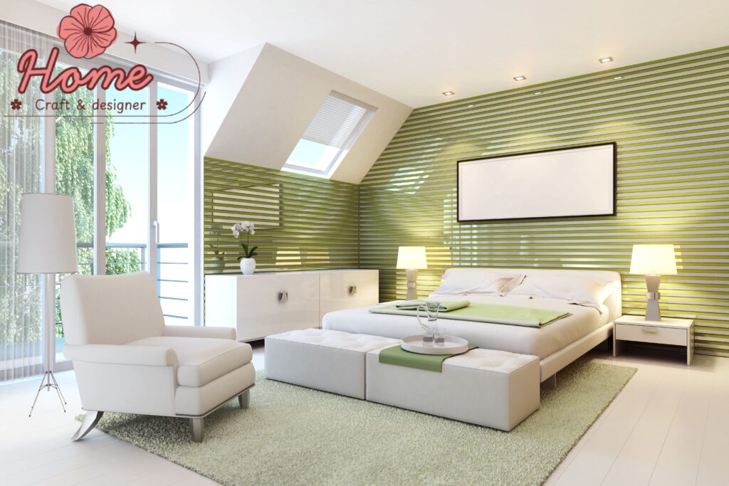
Blue and green are the colours most often linked to calmness, safety, and mental clarity in colour psychology research. They are also among the most popular choices for bedrooms, home offices, and bathrooms in Australian homes. Soft blue shades range from pale sky blue to deeper slate and denim tones. These colours reflect the qualities of open skies and water. As a result, they create a sense of space and tranquillity. This effect makes them especially suitable for bedrooms, where relaxation and restful sleep are important goals.
Green is strongly associated with nature and vegetation. Environmental psychologists say it activates the “restoration response.” This response can reduce stress and improve attention and mood. These benefits are linked to exposure to natural environments. Bringing green into interior spaces can enhance wellbeing. You can introduce it through paint, soft furnishings, or indoor plants. Its appeal goes beyond aesthetics. Sage, olive, forest, and eucalyptus are among the most popular green shades in Australian interiors today. These tones create a warm, earthy feel. They differ from the cooler and more artificial-looking greens that were common in earlier decorating trends.
Warm Colours: How Red, Orange, and Yellow Stimulate and Energise
Warm colours the reds, oranges, yellows, and terracottas of the warm end of the colour spectrum stimulate the nervous system, elevate energy levels, increase appetite, and encourage social interaction. These qualities make them particularly well-suited to dining rooms, kitchens, and social living spaces where energy and conviviality are desirable, while making them less appropriate for bedrooms or spaces intended for relaxation and rest.
In Australian homes, deep terracotta and rust tones have become enormously popular as warm accent colours, partly for their association with the Australian earth and landscape and partly for their ability to add depth and visual warmth without the aggression of a full red. A terracotta accent wall in a dining room, rust-toned cushions on a neutral sofa, or warm amber pendant lights over a kitchen island all introduce the stimulating energy of warm colour in doses that add interest rather than overwhelming the space. Yellow, used in its softer, more golden forms, brings optimism and light to north-facing rooms or spaces that receive limited natural light.
Neutral Colours: The Psychological Power of Calm, Balanced Spaces
The enduring popularity of neutral colour palettes in Australian interior design is not simply a matter of conservative taste — it reflects the genuine psychological benefit of visual calm and mental rest that well-chosen neutrals provide. In an era of constant digital stimulation, cognitive overload, and environmental complexity, the home increasingly functions as a sanctuary where neutral, quiet, visually unchallenging environments allow the nervous system to decompress and recover.
The current generation of popular interior neutrals has moved well beyond the cool grey palette that dominated the 2010s into a warmer, more complex family of tones: warm whites with creamy or peachy undertones, sandy greiges, warm taupe, and dusty blush. These warmer neutrals interact more harmoniously with natural light and wood tones than their cooler predecessors, creating spaces that feel inviting and grounded rather than clinical. The psychological effect of a well-executed neutral palette is a sense of spaciousness, calm, and timeless quality that allows the furniture, art, and inhabitants of the room to take centre stage.
Dark and Dramatic Colours: When Deep Tones Create Intimacy and Luxury
The use of deep, saturated colours — charcoal, navy, forest green, inky blue, rich burgundy — in interior spaces has moved from the fringe into the mainstream of Australian interior design, and for good reason. Far from making rooms feel smaller or gloomier as conventional wisdom once suggested, well-executed deep colour schemes create a sense of intimacy, luxury, and psychological cocooning that can be profoundly comforting and beautiful.
The psychological effect of dark interior colours is to create a defined, enclosed environment that feels private and protected — qualities that are genuinely desirable in bedrooms, home offices, media rooms, and dining rooms. A deep navy study feels more conducive to focused work than a stark white room; a charcoal-painted bedroom creates a sense of sensory retreat that supports sleep. The key to success with dark colours is using them in rooms with appropriate light sources, pairing them with warm natural materials and textures that prevent the palette from feeling cold, and trusting the process of allowing the colour to transform the spatial experience of the room.
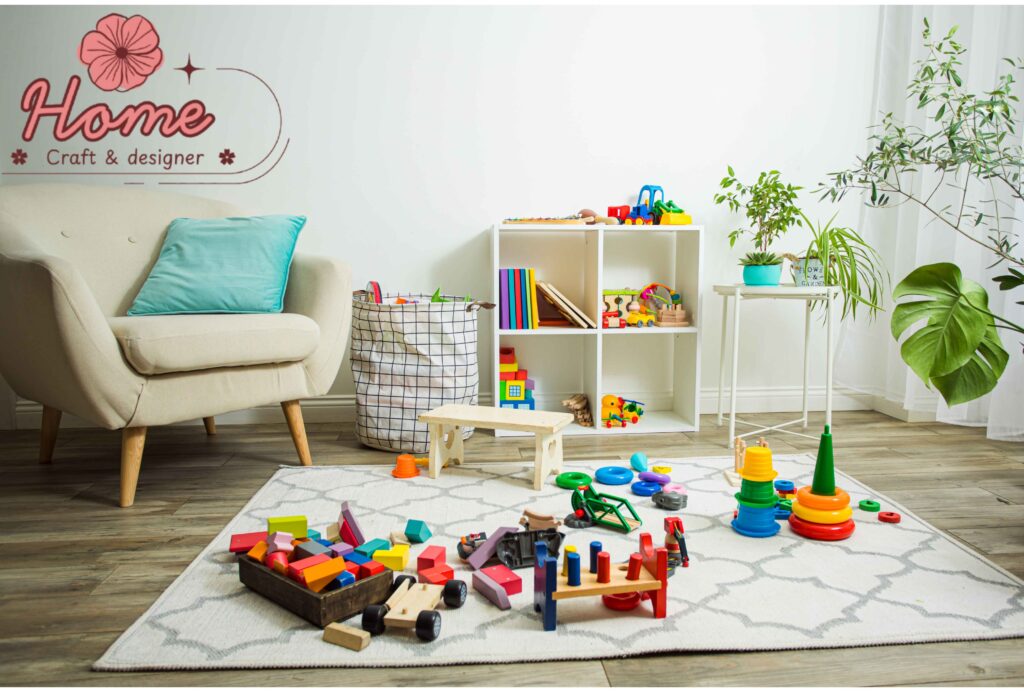
Applying Colour Psychology Practically: A Room-by-Room Guide
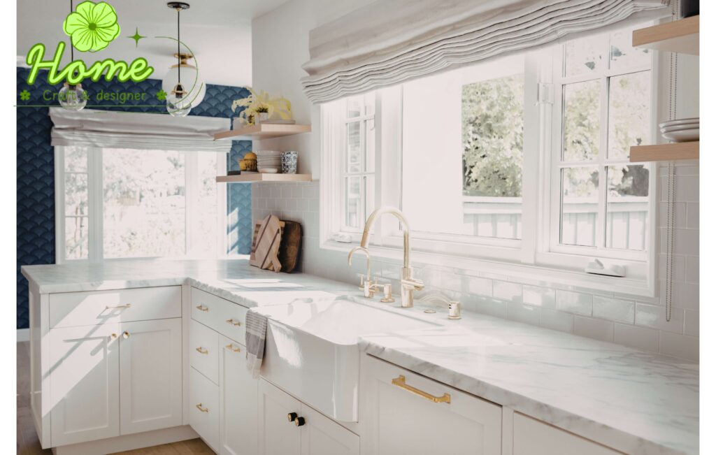
Applying colour psychology to interior design works best when you take a room-by-room approach. Consider each space’s main purpose, natural light levels, and the mood you want to create. In bedrooms, calming blues, sage greens, warm neutrals, and rich cocooning shades can promote relaxation and better sleep. Kitchens and dining areas benefit from warm whites, terracotta, soft yellows, and sage greens. These colours can encourage appetite and social interaction while maintaining a fresh and inviting look.
When designing a home office, consider how colour influences focus and energy throughout the working day. Stimulating warm tones often inspire creativity, while calming greens and blues support concentration and mental clarity. In living rooms, a foundation of warm neutrals provides a versatile backdrop for different styles and seasons. Cushions, throws, and accessories can then be updated to refresh the space throughout the year. Bathrooms benefit from spa-inspired shades such as soft greens, pale blues, and crisp whites. These colours help create a clean and restorative environment that enhances daily routines. Ultimately, colour psychology is not about following strict rules. Instead, it involves understanding the emotional impact of different hues and using them to create spaces that genuinely support the people who live in them.


